
MediaStore SDK Components Library
Check ourFAQ for more details about MediaStore SDK.
MediaStore SDK Components Library with ready-to-use components is our latest and most convenient implementation option to be used with React.JS.
To give you a better picture of what it is, imagine a big box with building blocks: this big box is the MediaStore SDK Components Library, and the building blocks are components.
You want to build a house - in our case a checkout or self-service customer account. So you simply pick the building blocks that you need and put them in the places where you want them to. In this way, you can build your application as you want it.
What is more, you can style your building blocks in the way you want. For more information, see the Styling section.
You can add a new language version or change default wording. For details, see Translations.
Note: Please visit these links if you want to find out more about MediaStore SDK architecture and authorization.
Good to knowYou can visit github with the demo application which shows how to integrate with Cleeng MediaStore SDK Components Library.
Main components
Checkout
With this big component, you get a complete purchase flow for your customers.
When you choose it, you get the following components:
For implementation information, please refer to MediaStore SDK Package documentation - Checkout component.
You can see the default look and feel in the screens in the respective components sections below.
You can style it according to your needs. For details, see Styling.
MyAccount
It is a big component that contains the whole "My Account" feature. When you choose it, you get the following components:
For implementation information, please refer to MediaStore SDK Package documentation - MyAccount component.
You can see the default look and feel in the screens below:

"My Account: Plan Details" - MediaStore SDK

"My Account: Your Payments" - MediaStore SDK

"My Account: Update Profile" - MediaStore SDK
Grace Period - Payment Issue Message
MyAccount component is the place where you can display a message for a customer when they are in a grace period and their payment has failed.
To switch it on, pass the displayGracePeriodError prop to the PlanDetails (see the MediaStore Package NPM documentation) and/or PaymentInfo component (see the MediaStore Package NPM documentation).
By default, the message looks like in the screenshot below. You can also customize it by using the translations feature using the following key for this sentence: grace-period-error.

Grace Period - Payment Issue Message
Subcomponents
Register
This component is responsible for displaying a basic Cleeng registration form. It is a registration form with consents approval for new customers (who don't have an account yet).
Registered customers are shown in the 'Customer Accounts' dashboard. You can go to 'Customer Accounts' page on sandbox or production.
For implementation information, please refer to MediaStore SDK Package documentation - Register component.
You can see the default look and feel of the form is in the screen below:

"Register" Form - MediaStore SDK
You can style it according to your needs. For details, see Styling.
Login
This component is responsible for displaying a basic Cleeng login form.
For implementation information, please refer to MediaStore SDK Package documentation - Login component.
You can see the default look and feel of the form is in the screen below:

"Login" Form - MediaStore SDK
You can style it according to your needs. For details, see Styling.
PasswordReset
This component is responsible for displaying a reset password form. It allows customers to reset their password if for example, they forget it.
For implementation information, please refer to MediaStore SDK Package documentation - PasswordReset component.
You can see the default look and feel of the form in the screen below:

"PasswordReset" Form - MediaStore SDK
You can style it according to your needs. For details, see Styling.
CheckoutConsents
The CheckoutConsents component is a form that contains all consents that have to be confirmed by a customer. It is used to check the consents after login.
For implementation information, please refer to MediaStore SDK Package documentation - CheckoutConsents component.
You can see the default look and feel of the form in the screen below:

"Consents" Form - MediaStore SDK
You can style it according to your needs. For details, see Styling.
Capture
The Capture component displays a form used for gathering customer data that you want to collect.
You can enable the Custom Fields feature (previously known as Capture), and configure its settings in the Cleeng dashboard. For more information, see Cleeng Custom Fields.
For implementation information, please refer to MediaStore SDK Package documentation - Capture component.
You can see the default look and feel of the form is in the screen below:

"Capture" Form - MediaStore SDK
You can style it according to your needs. For details, see Styling.
Purchase
Purchase is a component that enables customers to buy an offer in the Cleeng system.
As mentioned before, you have to be logged in before showing that component. To do so, use the Login/Register component.
Note:
Before showing this component you may need to change theofferIdsetting (if it is different than configured earlier).
For implementation information, please refer to MediaStore SDK Package documentation - Purchase component.
You can see the default look and feel of the form on the screen below:
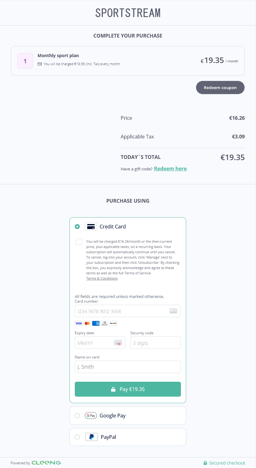
"Purchase" Screen - MediaStore SDK
You can style it according to your needs. For details, see Styling.
Please note that starting with version 5.6.0 of MediaStore Components, you can disable displaying the consent checkbox for payment method. To use this feature and disable the payment method consent requirement, please make sure that it is legally compliant - in accordance with terms of service and your agreement with Cleeng. For more information on implementation, see MediaStore SDK package documentation - Usage -> Configuration information.
RedeemGift
This component gives users the possibility to redeem a code and obtain access to the offer they received as a gift.
It can be displayed only to logged in users.
For implementation information, please refer to MediaStore SDK Package documentation - RedeemGift component.
You can see the default look and feel of the “Redeem your gift” screen below:
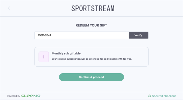
"Redeem Gift" - MediaStore SDK
You can style it according to your needs. For details, see Styling.
PlanDetails
It allows your customers to manage their subscriptions.
This component comprises the following two:
If you want to give your customers access to both their current subscription plan and also present them with options to upgrade or downgrade, the PlanDetails component is a perfect choice to save time and effort.
For implementation information, please refer to MediaStore SDK Package documentation - PlanDetails component.
You can see the default look and feel of the form in the screen below:

"Plan details" - MediaStore SDK
You can style it according to your needs. For details, see Styling.
Subscription management
PlanDetails component provides the following subscription management options:
- subscription upgrade
- subscription downgrade
- cancelling a switch which is pending
- downgrading a subscription as an alternative to cancellation.
ImportantPre-configuration in the Dashboard is required for the above subscription management options to work. Depending on the subscription switch settings (algorithms that you select), you might also need to subscribe to appropriate webhooks. Please refer to the Prerequisites section for details.
Please see the example flows below:
Subscription upgrade
Please note the flow below shows the situation when the switch settings allow the customer to get access to the new plan instantly.

"Plan details: subscription upgrade" flow - MediaStore SDK
Subscription downgrade
Please note that the flow below shows the situation when the subscription switch is deferred - the subscription plan and access rights change when the subscription renews. Then a customer may still change his/her mind before the actual switch takes place.

"Plan details: subscription downgrade" flow - MediaStore SDK
Pending subscription switch cancellation
You can change a pending switch only if it is not being processed yet (when payment authorization has not been made yet).

"Plan details: cancelling a pending switch" flow - MediaStore SDK
Subscription downgrade as an alternative to cancellation
If downgrade options for a given subscription are configured and available, the PlanDetails component by default shows subscription downgrade options to a customer when he/she presses the Unsubscribe button.

"Plan details: downgrade options as an alternative to cancellation" flow - MediaStore SDK
If you want to skip showing available downgrades in the unsubscribe process, use skipAvailableDowngradesStep prop (see the MediaStore Package NPM documentation).
The unsubscribe flow will then look different, see the example below:

"Plan details: cancellation without downgrade options" flow - MediaStore SDK
Subscriptions
This component lists all subscriptions that are linked with a given logged-in customer.
For implementation information, please refer to MediaStore SDK Package documentation - Subscriptions component.
You can see the default look and feel of the Subscriptions component in the screen below:

"Subscriptions" - MediaStore SDK
You can style it according to your needs. For details of styling options see Styling.
SubscriptionSwitches
It shows a list of available switches (upgrade, downgrade options) for a given subscription. It is a must-have component if you want to offer customers more choice.
For implementation information, please refer to MediaStore SDK Package documentation - SubscriptionSwitches component.
You can see the default look and feel of the SubscriptionSwitches component presenting upgrade options in the screen below:

"Subscription Switches" - MediaStore SDK
You can style it according to your needs. For details, see Styling.
You can refer to PlanDetails section to see the example of subscription upgrade flow when a customer selects the Upgrade button.
PaymentInfo
Select this component if you want to show your customers all information about their payments:
- payment methods
- transactions that took place in the past (TransactionList component)
For implementation information, please refer to MediaStore SDK Package documentation - PaymentInfo component.
You can see the default look and feel of the PaymentInfo component in the screen below:

"Payment Info" - MediaStore SDK
You can style it according to your needs. For details, see Styling.
TransactionList
It contains only information about all transactions that took place in the past.
For implementation information, please refer to MediaStore SDK Package documentation - TransactionList component.
You can see the default look and feel of the list of transactions in the screen below:

"Transactions List" - MediaStore SDK
You can style it according to your needs. For details, see Styling.
UpdateProfile
It displays all information about a current customer. It also empowers a customer to change that profile details.
For implementation information, please refer to MediaStore SDK Package documentation - UpdateProfile component.
You can see the default look and feel of the UpdateProfile component in the screen below:

"Update Profile" - MediaStore SDK
You can style it according to your needs. For details, see Styling.
Up next
Ready to start? Go ahead with Integration Guide.
Updated 4 months ago