List of Components
This article gives you an overview of MediaStore SDK components. You can choose and import them in the places in your application where you want them to be.
Checkout
With this big component, you get a complete purchase flow for your customers.
When you choose it, you get the following components:
For implementation information, please refer to MediaStore SDK Package documentation - Checkout component.
You can see the default look and feel in the screens in the respective sections below.
You can style it according to your needs. For details of styling options see Styling.
MyAccount
It is a big component that contains the whole "My Account" feature. When you choose it, you get the following components:
For implementation information, please refer to MediaStore SDK Package documentation - MyAccount component.
You can see the default look and feel in the screens below:
Register
This component is responsible for displaying a basic Cleeng registration form. It is a registration form with consents approval for new customers (who don't have an account yet).
Registered customers are shown in the 'Customer Accounts' dashboard. You can go to 'Customer Accounts' page on sandbox or production.
For implementation information, please refer to MediaStore SDK Package documentation - Register component.
You can see the default look and feel of the form is in the screen below:
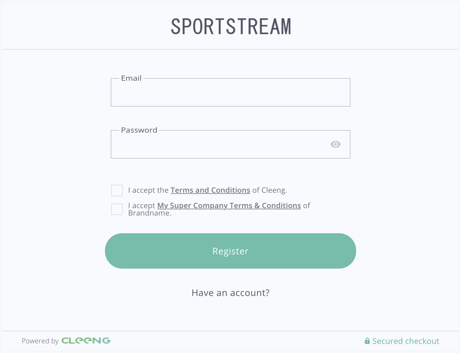
"Register" Form - MediaStore SDK
You can style it according to your needs. For details of styling options see Styling.
Login
This component is responsible for displaying a basic Cleeng login form.
For implementation information, please refer to MediaStore SDK Package documentation - Login component.
You can see the default look and feel of the form is in the screen below:
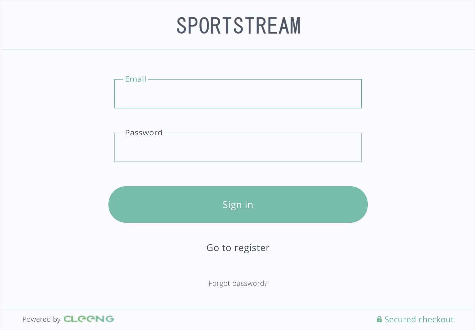
"Login" Form - MediaStore SDK
You can style it according to your needs. For details of styling options see Styling.
PasswordReset
This component is responsible for displaying a reset password form. It allows customers to reset their password if for example, they forget it.
For implementation information, please refer to MediaStore SDK Package documentation - PasswordReset component.
You can see the default look and feel of the form in the screen below:
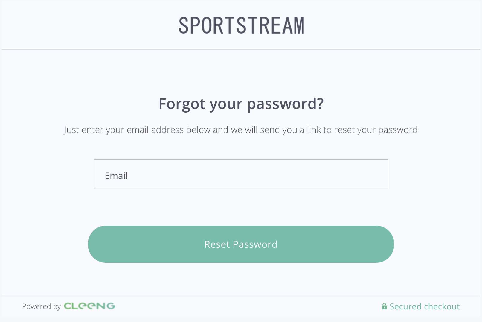
"Password Reset" Form - MediaStore SDK
You can style it according to your needs. For details of styling options see Styling.
CheckoutConsents
The CheckoutConsents component is a form that contains all consents that have to be confirmed by a customer. It is used to check the consents after login.
For implementation information, please refer to MediaStore SDK Package documentation - CheckoutConsents component.
You can see the default look and feel of the form in the screen below:
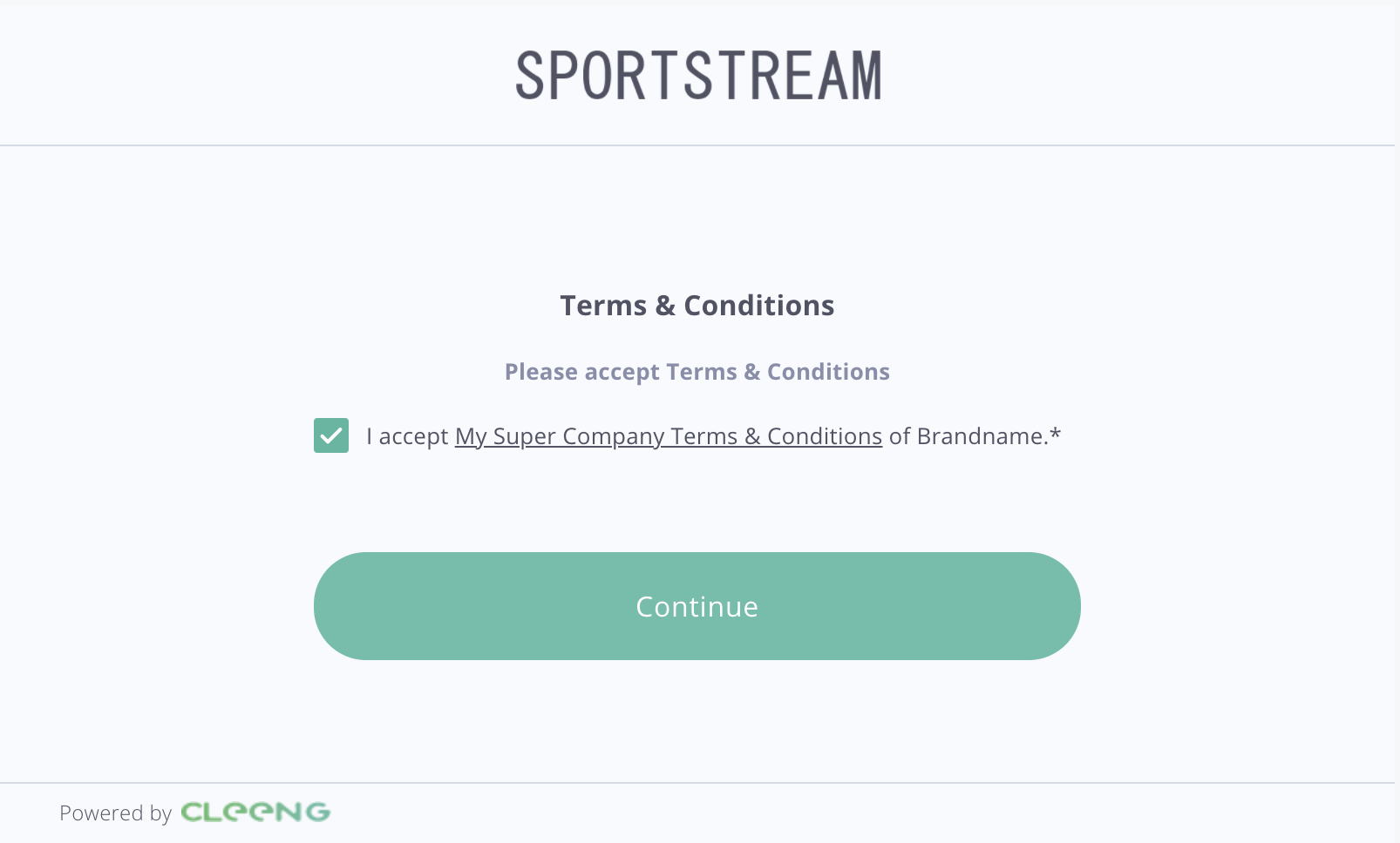
"Consents" Form - MediaStore SDK
You can style it according to your needs. For details of styling options see Styling.
Capture
The Capture component displays a form used for gathering customer data that a broadcaster wants to collect.
A broadcaster can enable the capture feature and configure its settings in the Cleeng dashboard. For more information, see Cleeng Capture.
For implementation information, please refer to MediaStore SDK Package documentation - Capture component.
You can see the default look and feel of the form is in the screen below:
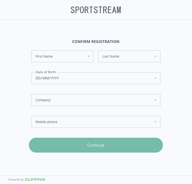
"Capture" Form - MediaStore SDK
You can style it according to your needs. For details of styling options see Styling.
Purchase
Purchase is a component that enables customers to buy an offer in the Cleeng system.
As mentioned before, you have to be logged in before showing that component. To do so, use the Login/Register component.
Note:
Before showing this component you may change theofferIdsetting (if it is different than configured earlier).
For implementation information, please refer to MediaStore SDK Package documentation - Purchase component.
You can see the default look and feel of the form is in the screen below:
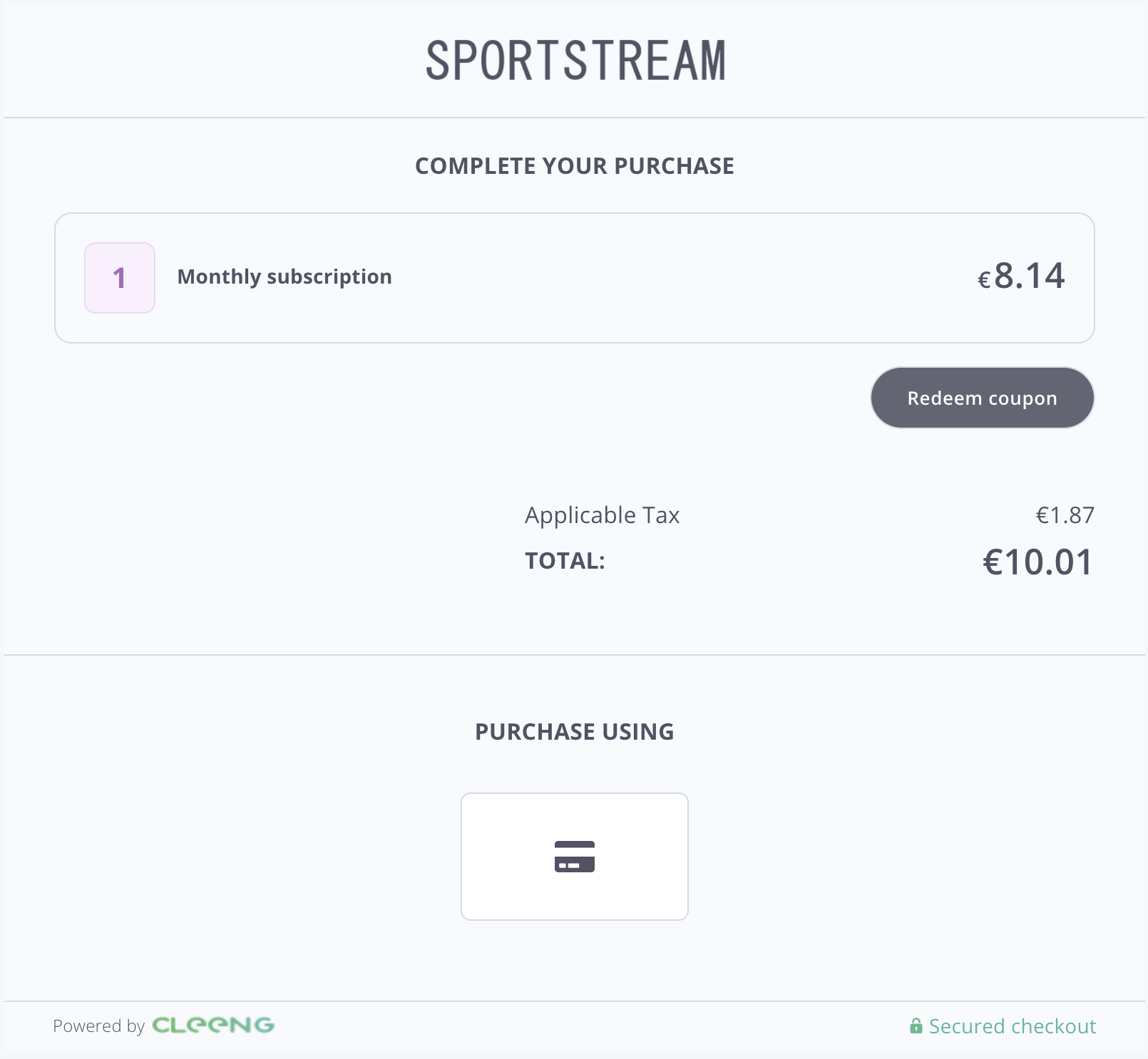
"Purchase" Screen - MediaStore SDK
You can style it according to your needs. For details of styling options see Styling.
PlanDetails
It allows your customers to manage their subscriptions.
This component comprises the following two:
If you want to give your customers access to both their current subscription plan and also present them with options to upgrade, the PlanDetails component is a perfect choice to save time and effort.
For implementation information, please refer to MediaStore SDK Package documentation - PlanDetails component.
You can see the default look and feel of the form in the screen below:
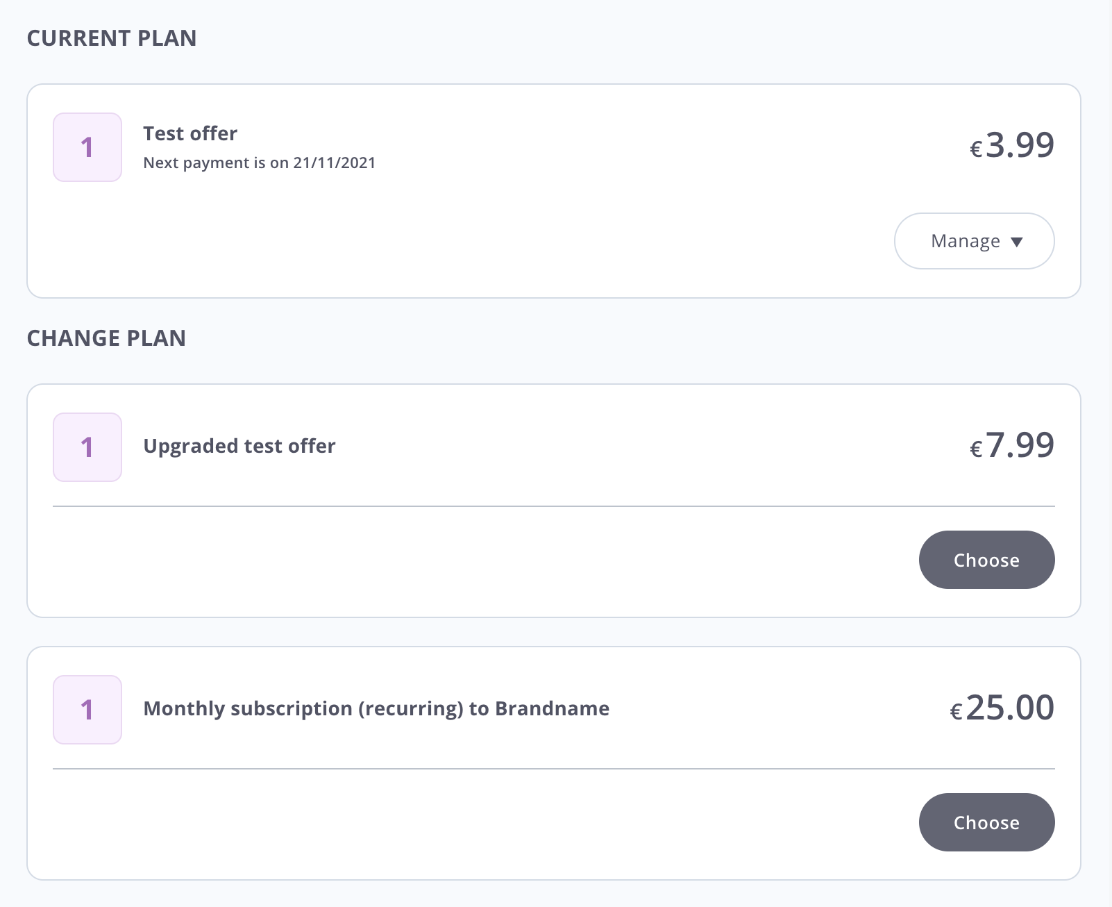
"Plan details" - MediaStore SDK
You can style it according to your needs. For details of styling options see Styling.
Subscriptions
This component lists all subscriptions that are linked with a given logged-in customer.
For implementation information, please refer to MediaStore SDK Package documentation - Subscriptions component.
You can see the default look and feel of the Subscriptions component in the screen below:

"Subscriptions" - MediaStore SDK
You can style it according to your needs. For details of styling options see Styling.
SubscriptionSwitches
It shows a list of available switches (upgrade options) for a given subscription. It is a must-have component if you want to offer customers more choice.
For implementation information, please refer to MediaStore SDK Package documentation - SubscriptionSwitches component.
You can see the default look and feel of the SubscriptionSwitches component presenting upgrade options in the screen below:
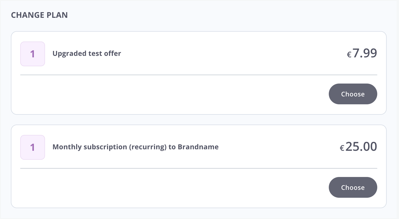
"Subscription Switches" - MediaStore SDK
You can style it according to your needs. For details of styling options see Styling.
PaymentInfo
Select this component if you want to show your customers all information about their payments:
- payment methods
- transactions that took place in the past (TransactionList component)
For implementation information, please refer to MediaStore SDK Package documentation - PaymentInfo component.
You can see the default look and feel of the PaymentInfo component in the screen below:
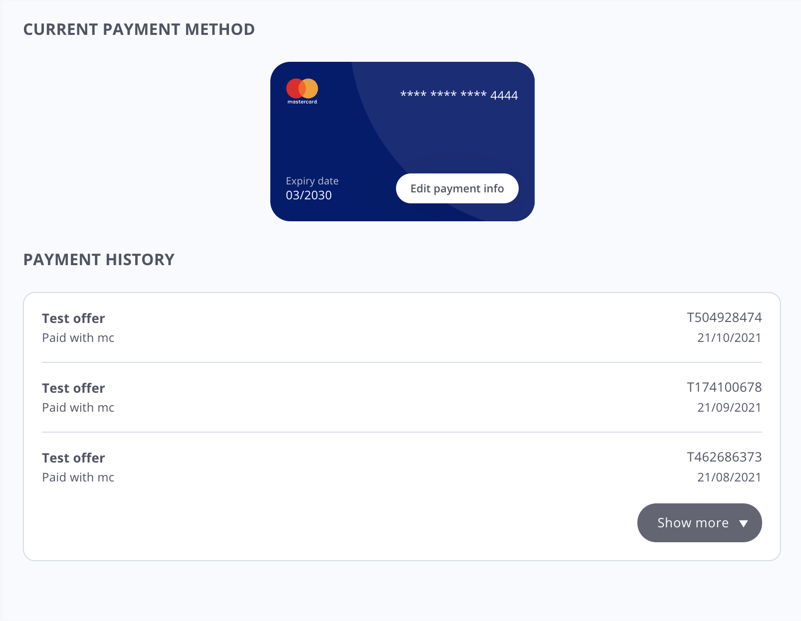
"Payment Info" - MediaStore SDK
You can style it according to your needs. For details of styling options see Styling.
TransactionList
It contains only information about all transactions that took place in the past.
For implementation information, please refer to MediaStore SDK Package documentation - TransactionList component.
You can see the default look and feel of the list of transactions in the screen below:
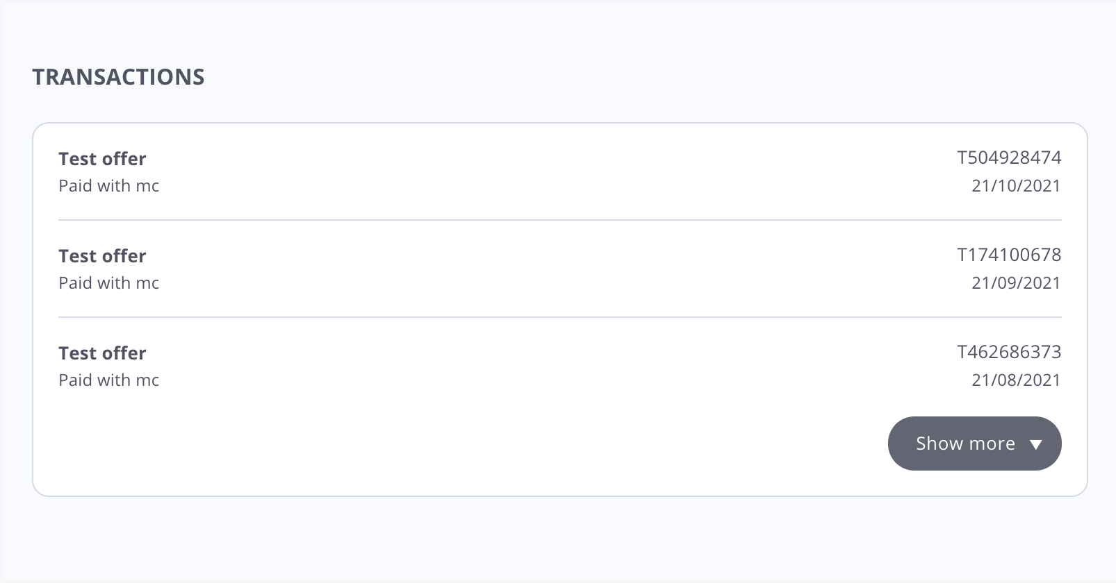
"Transactions List" - MediaStore SDK
You can style it according to your needs. For details of styling options see Styling.
UpdateProfile
It displays all information about a current customer. It also empowers a customer to change that profile information. Customers would be able to change
For implementation information, please refer to MediaStore SDK Package documentation - UpdateProfile component.
You can see the default look and feel of the UpdateProfile component in the screen below:
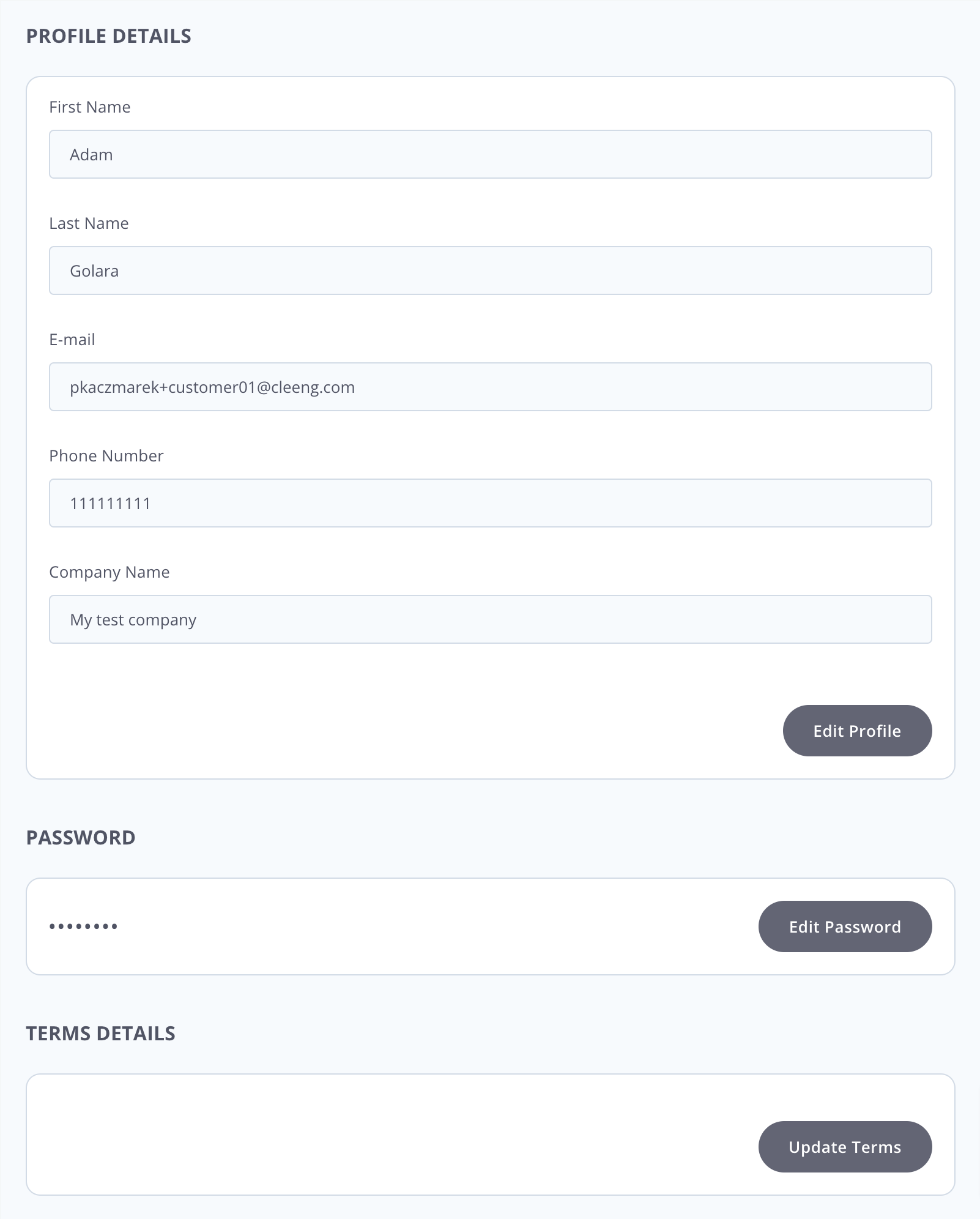
"Update Profile" - MediaStore SDK
You can style it according to your needs. For details of styling options see Styling.
Updated 11 months ago
